Logo Re-Design - SATHWA
Year
Client
Services
Project
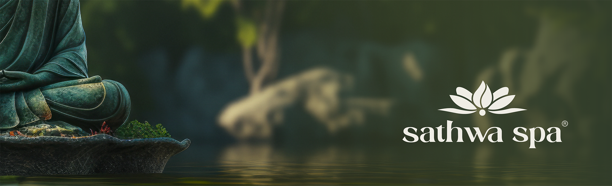
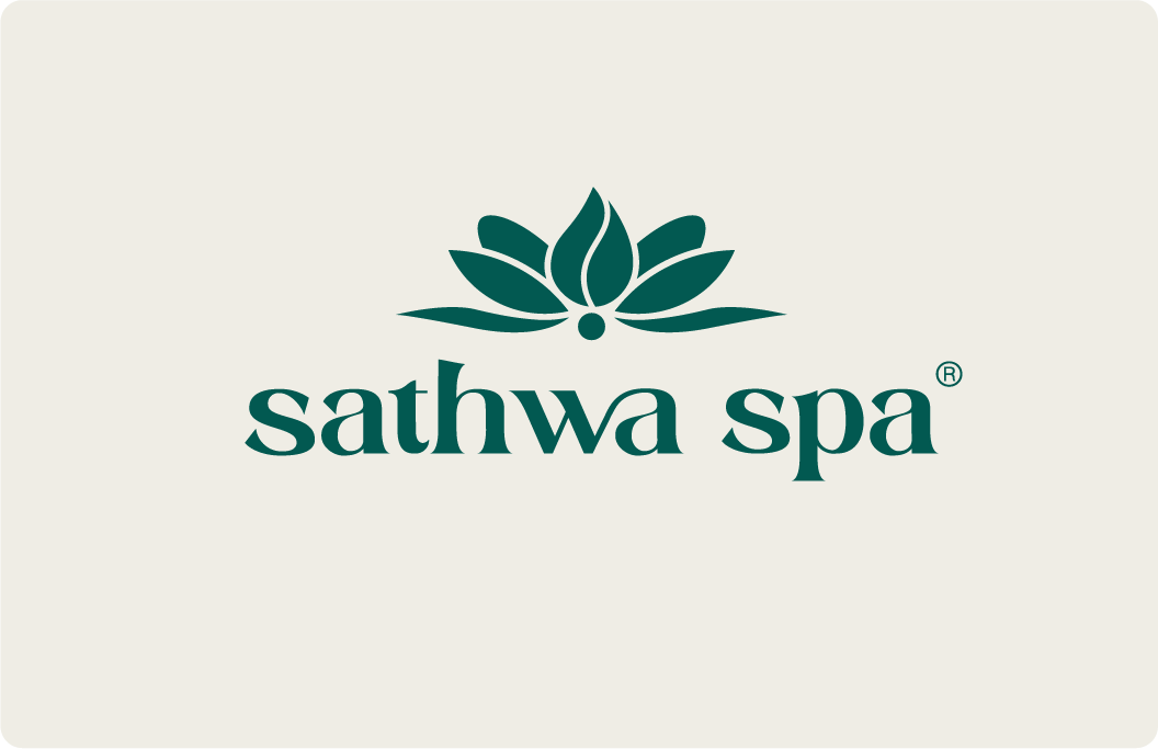
For Sathwa Spa, the rebranding journey ended up being more of a careful refresh than a big change- and that felt just right. Sathwa Spa already has a beautiful story rooted in calmness, tradition, and luxury, so the focus was on tweaking the logo to feel more polished and timeless without losing its soul.
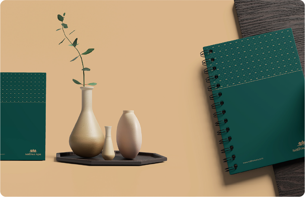
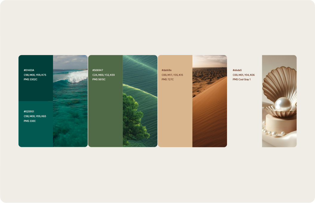
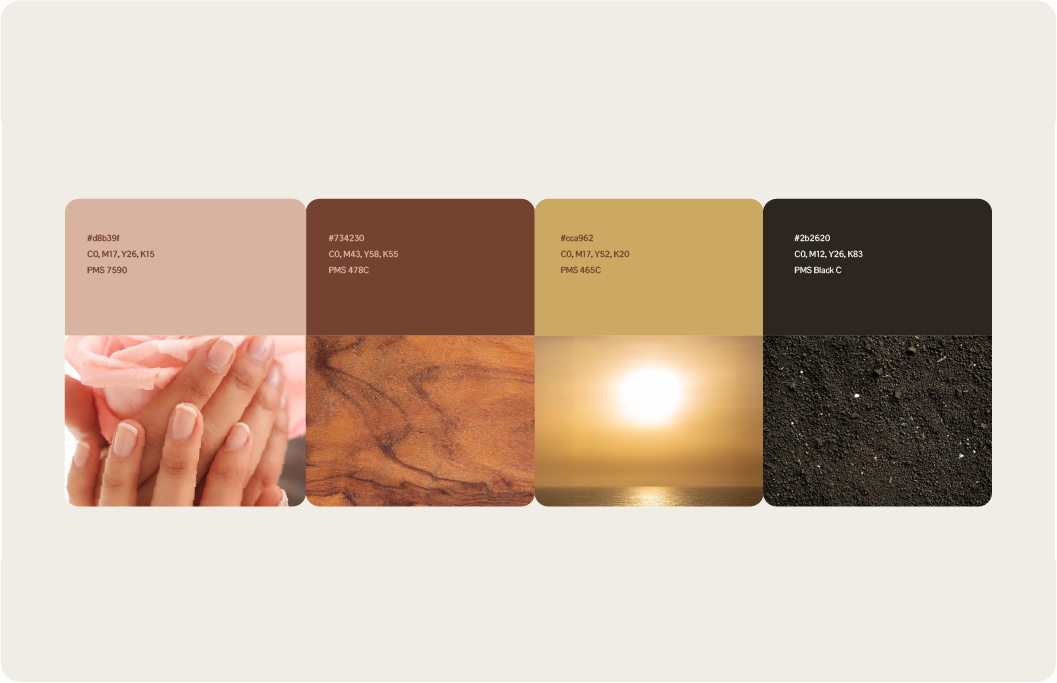
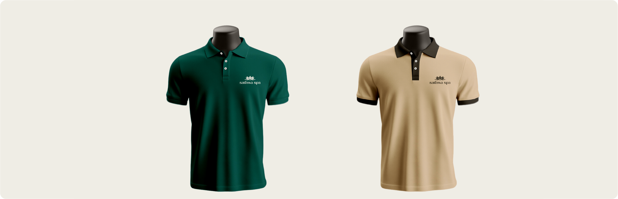
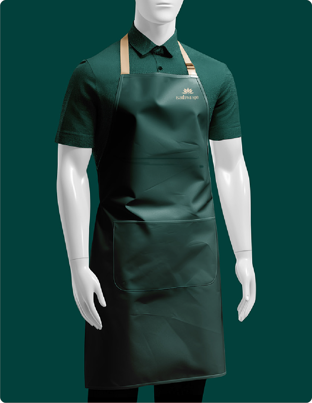
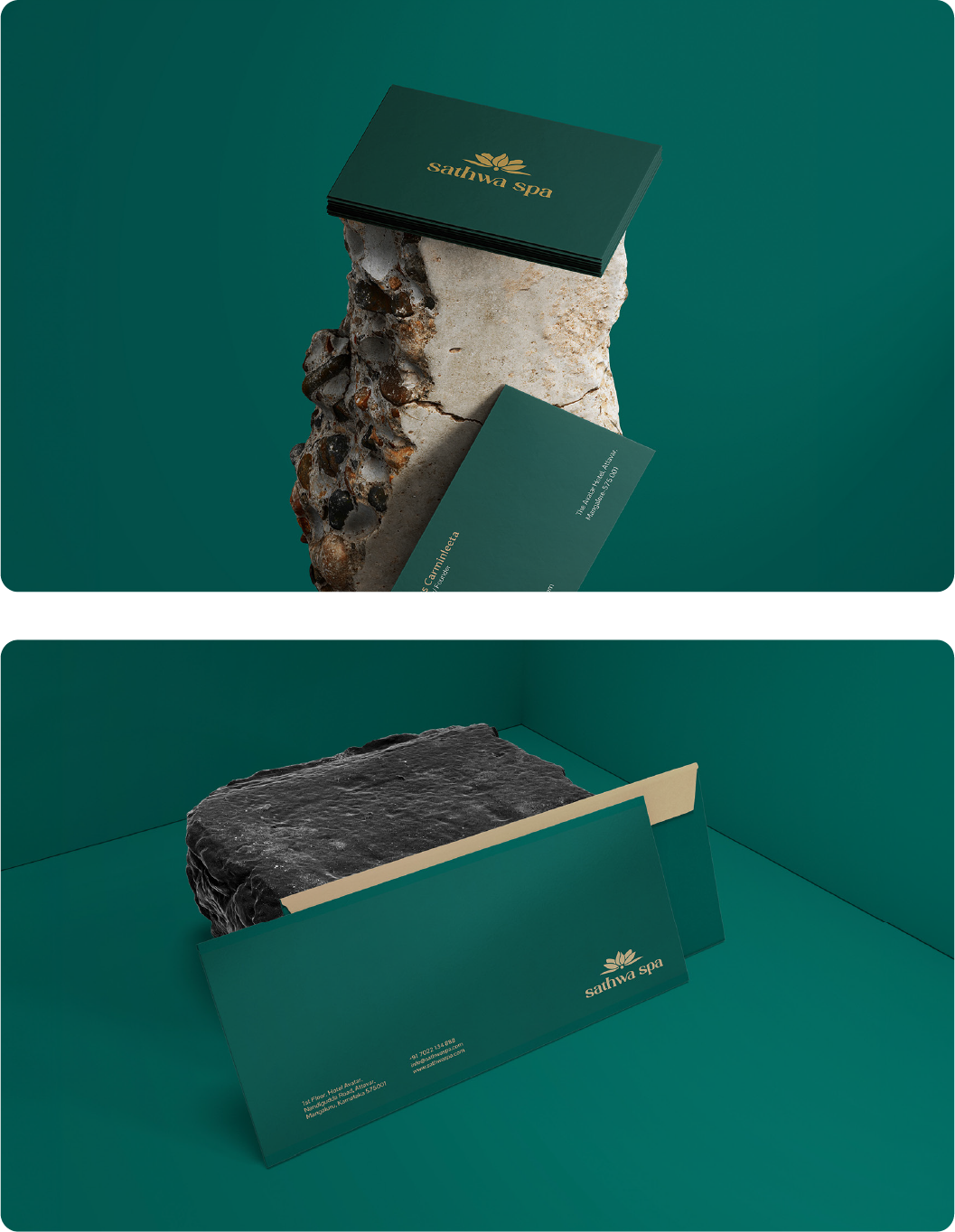
The lotus icon stays at the heart of it all, with its five petals symbolizing purity, calm, and the path to inner peace. The colors we use - deep greens, warm neutrals, and soft earthy tones keep everything feeling natural, soothing, and elegant. This small update helps the brand look more refined and aligned with the sanctuary-like experience Sathwa Spa promises. It’s still the same place people trust for relaxation and wellness, now with a look that feels just a bit more graceful and fresh.
Reach out and let's make it happen ✨. I'm also available for full-time or Part-time opportunities to push the boundaries of design and deliver exceptional work.