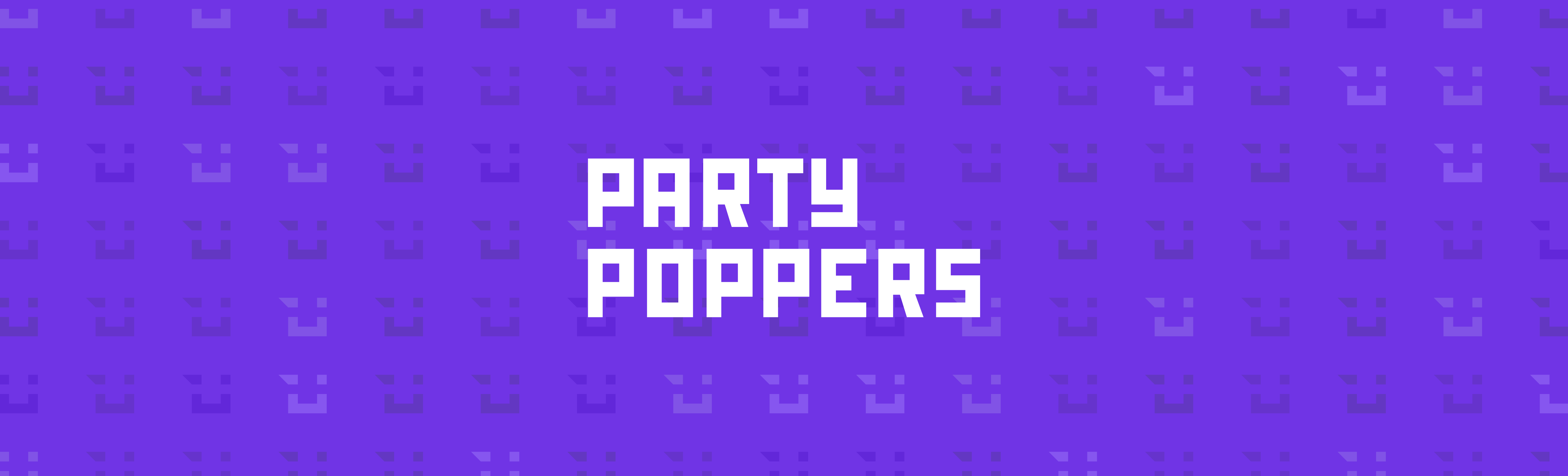
BRANDING - Party Poppers
Year
Client
Services
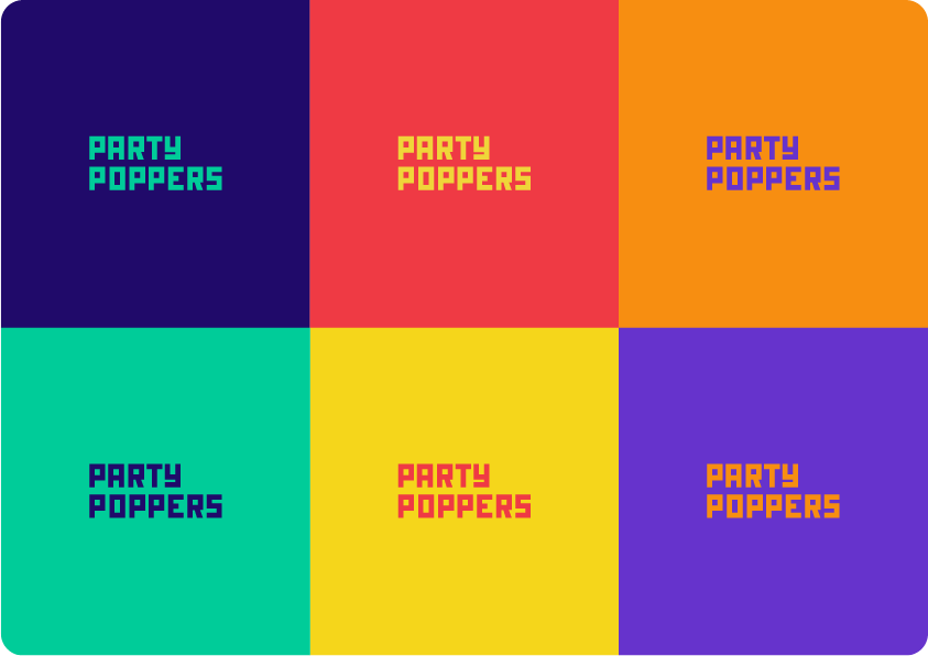
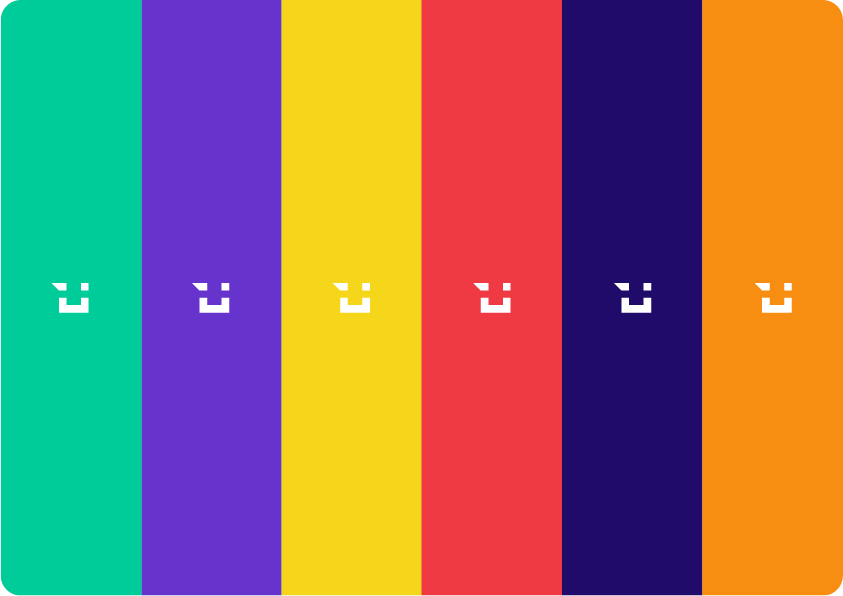
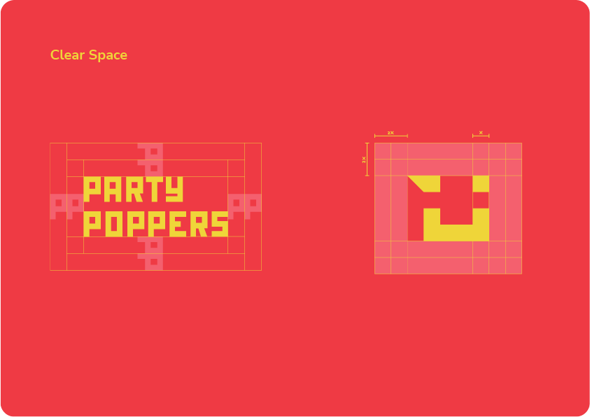
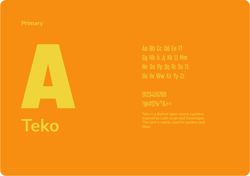
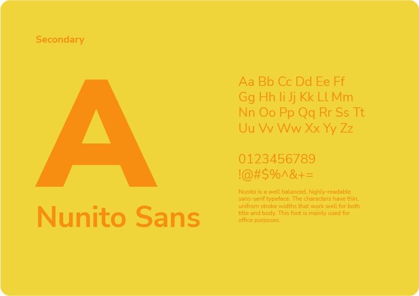
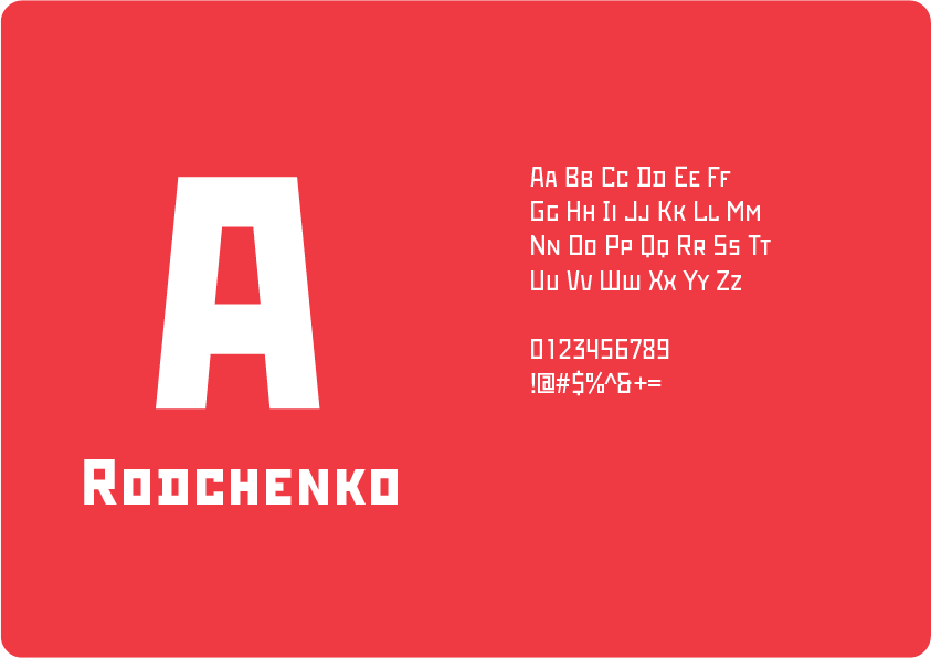
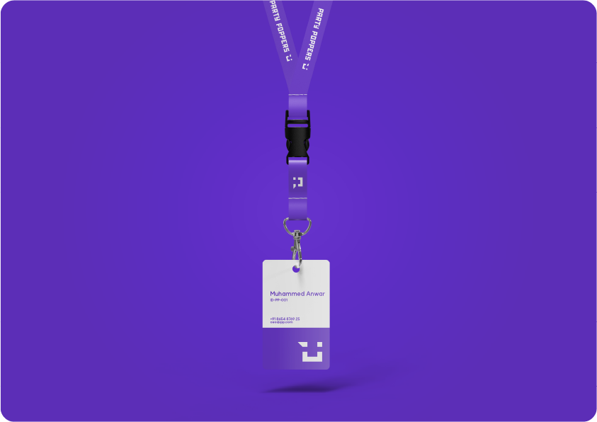
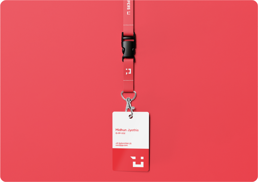
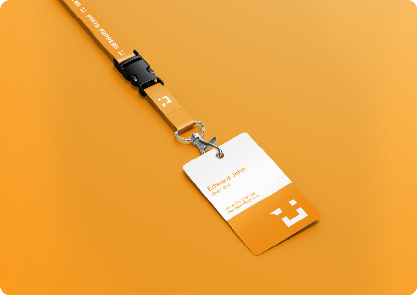
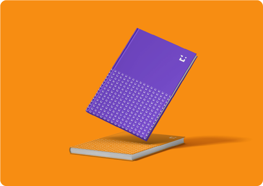
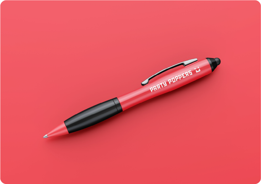
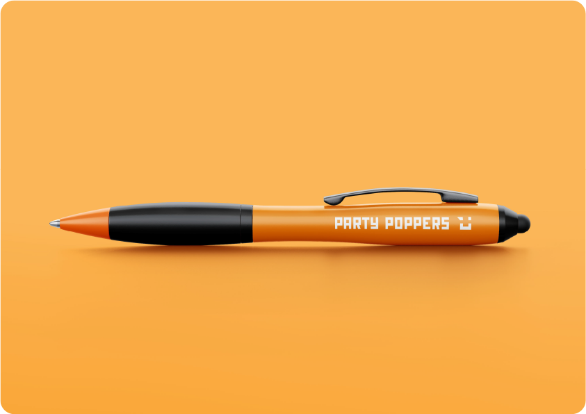
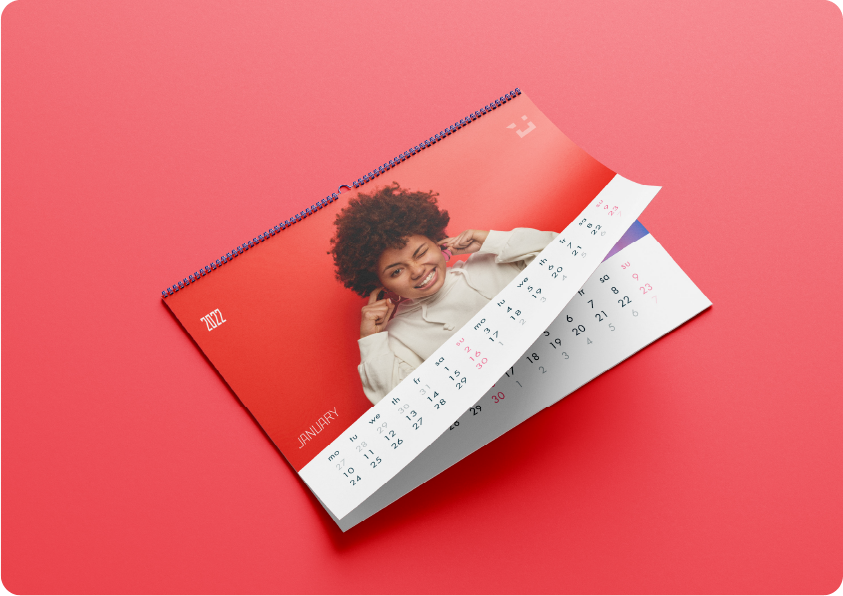
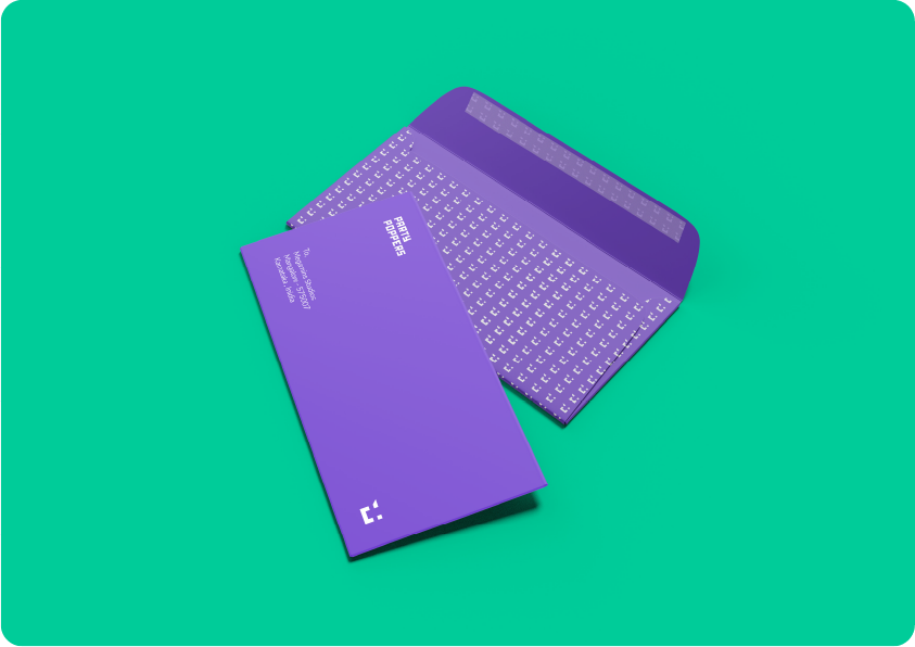
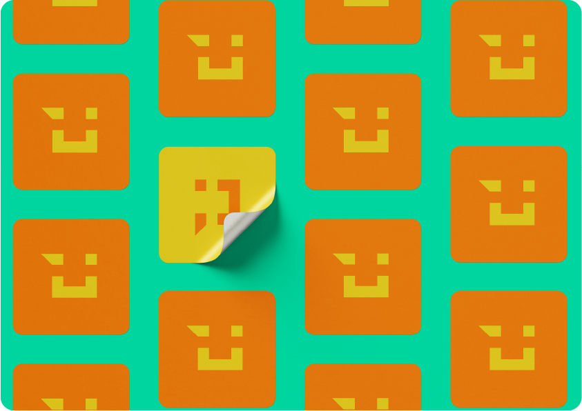
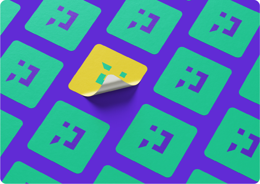
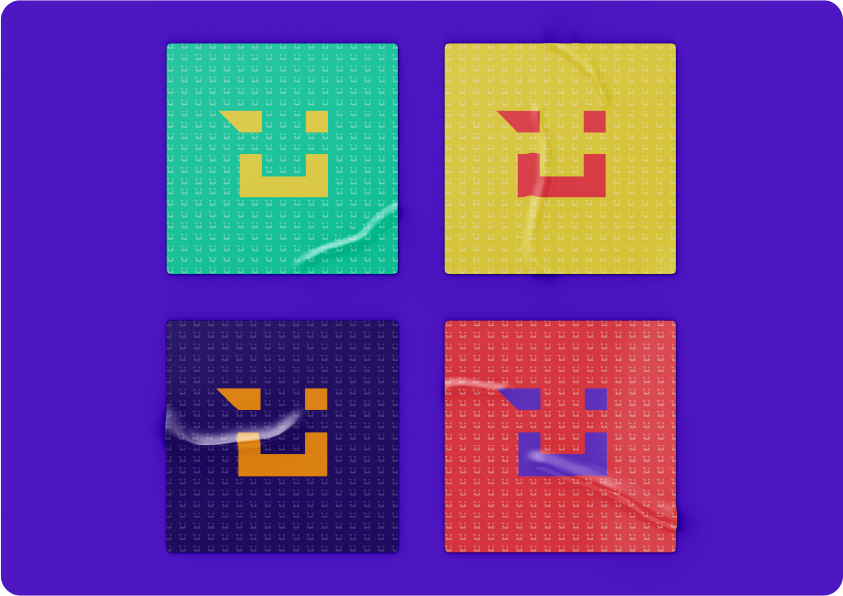
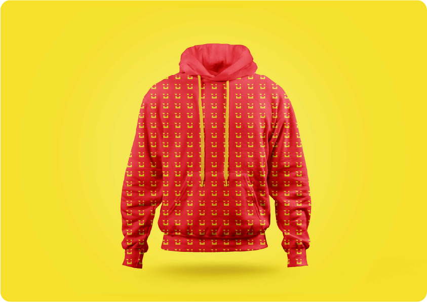
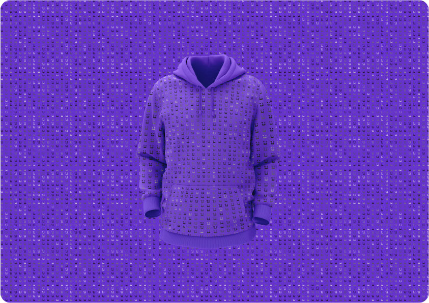
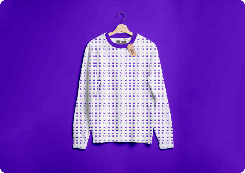
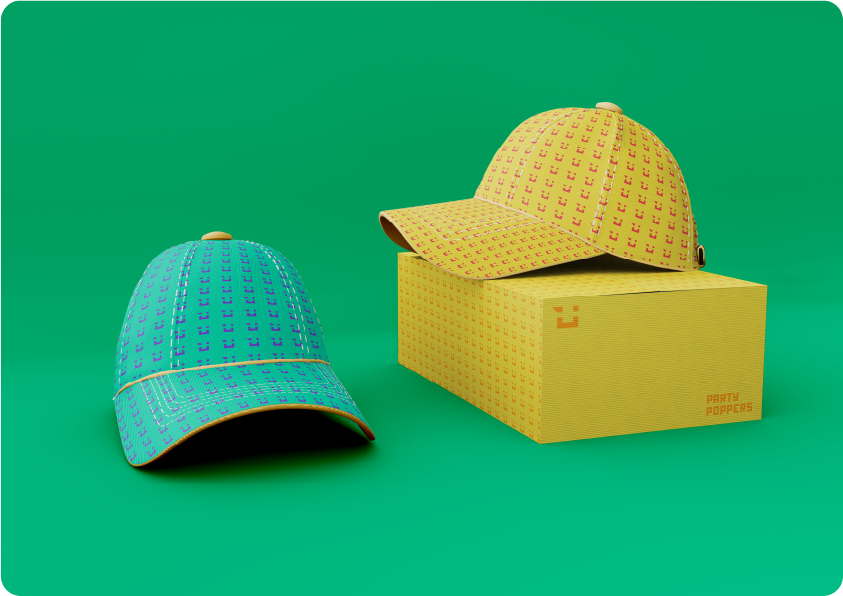
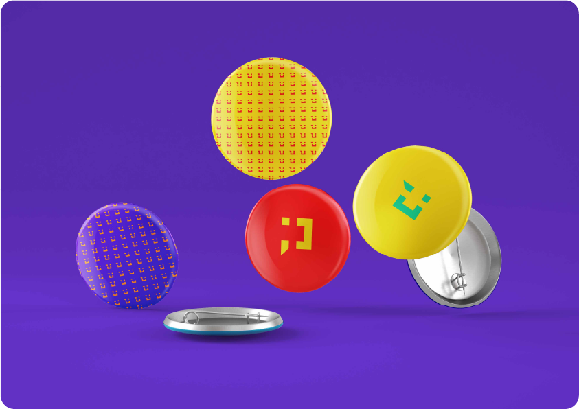
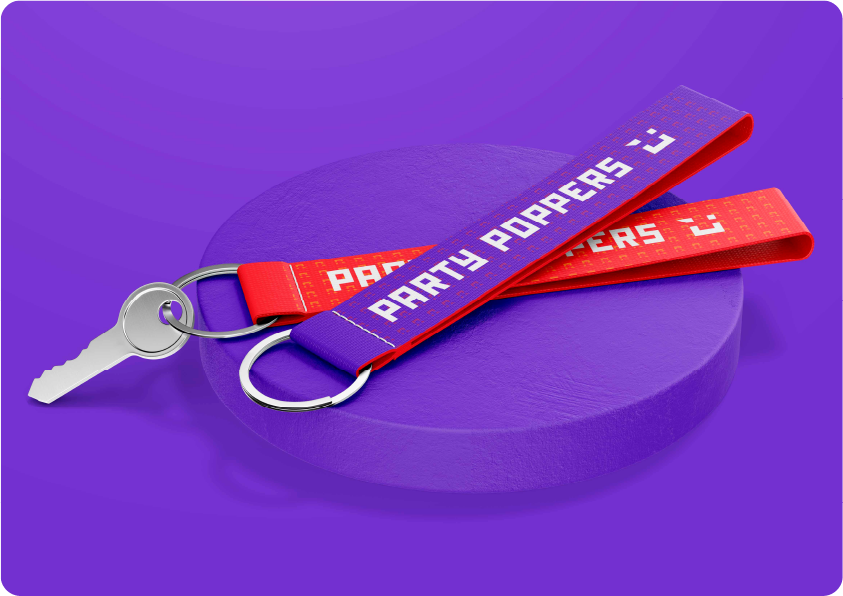
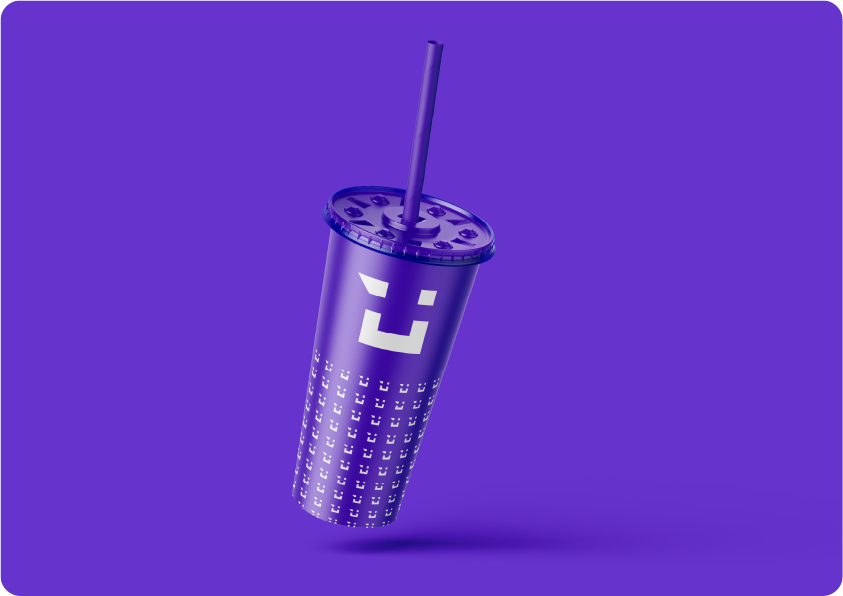
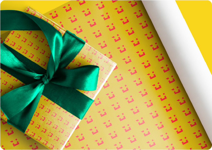
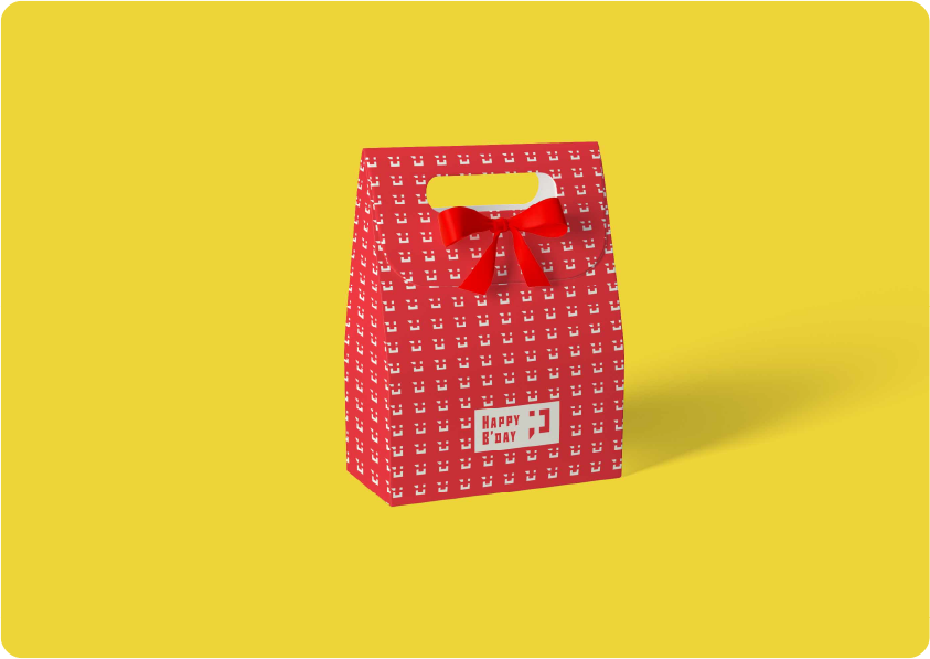
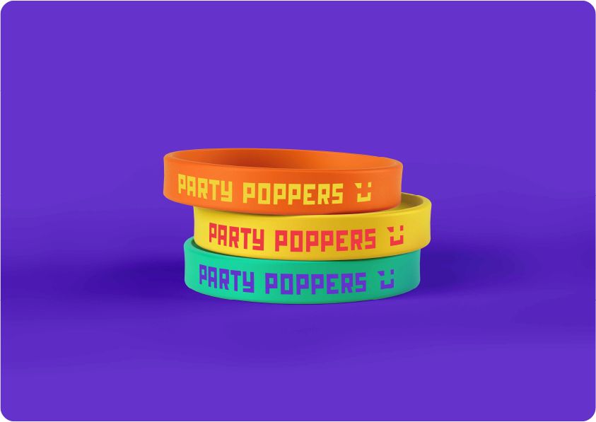
For Party Poppers, we wanted the brand to feel super fun, young, and full of energy. Since they plan parties for people aged 18 to 35, it needed to look playful and stand out. We used a bright, vibrant color palette to match the lively vibe and keep it exciting for a young crowd.The logo has a bold, boxy look that feels strong but playful, making it easy to spot and remember. The wink icon adds a cheeky, fun touch and when you rotate it 90 degrees anti-clockwise, it turns into a letter P. It’s simple, fresh, and just feels like a good time, exactly what Party Poppers is all about.

Reach out and let's make it happen ✨. I'm also available for full-time or Part-time opportunities to push the boundaries of design and deliver exceptional work.