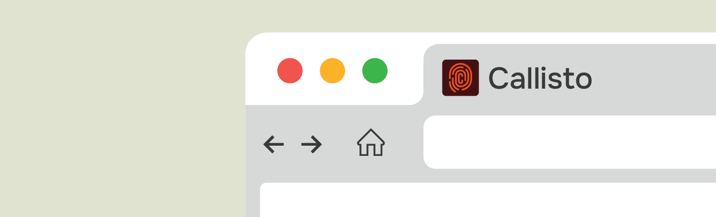
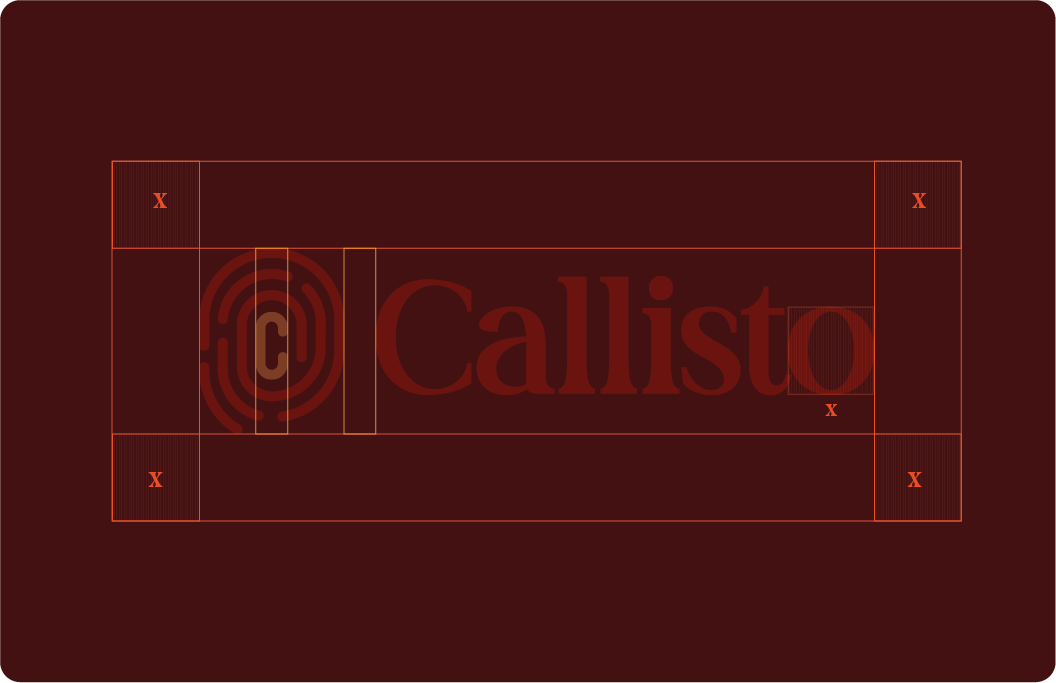
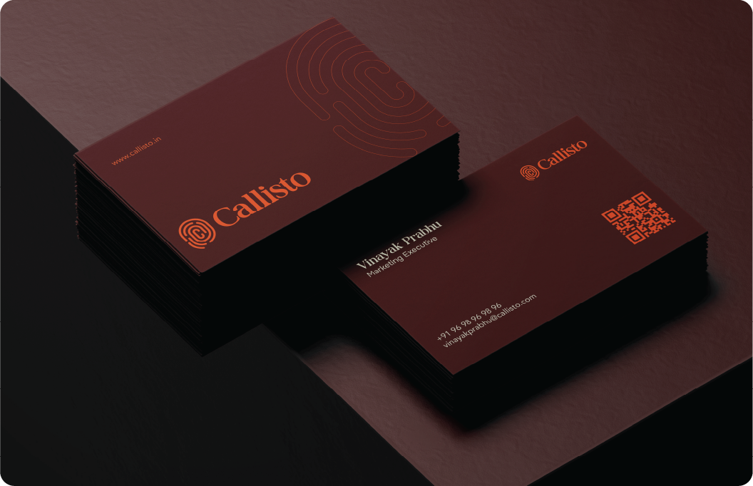
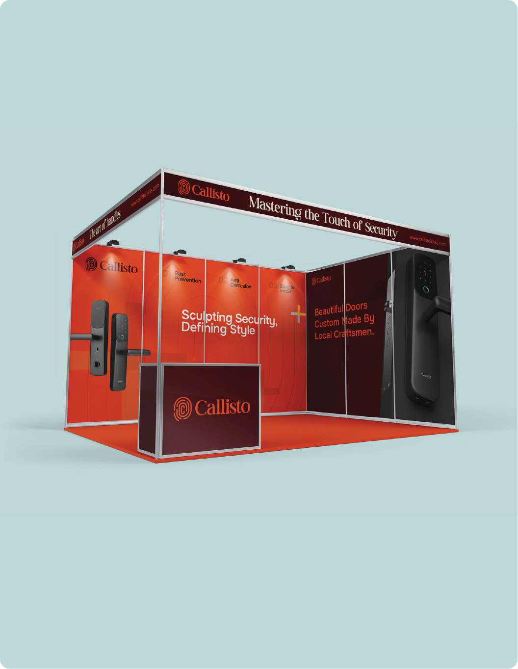
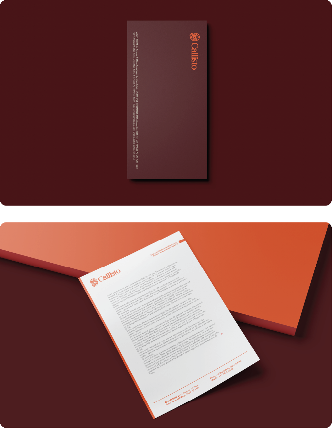
Logo Design - Callisto
Year
Client
Services
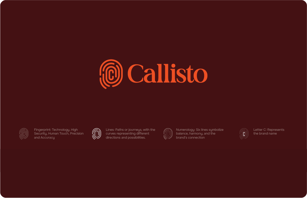
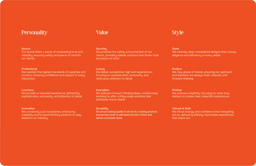
For this project, we wanted the Callisto logo to feel strong, modern, and easy to trust. The idea was to keep it simple but still make it stand out, so it’s memorable wherever it’s used. We focused on shapes and colors that show security and a bit of luxury, but without overcomplicating things. We chose bright colors because they bring energy and make the brand feel alive and forward-thinking. It’s a way to show that Callisto isn’t just safe and reliable it’s also dynamic, innovative, and ready for the future. Bright colors add that spark, so people remember it. this is to fill the line so it will feel balanced

Reach out and let's make it happen ✨. I'm also available for full-time or Part-time opportunities to push the boundaries of design and deliver exceptional work.